There has been a recent change to the way Shawnee Mission School District streams its board meetings. While it may not be very apparent to someone watching for the first time, if you compare May's recording to June's you can certainly tell the difference.
For a number of months, I have been using the publicly available recordings of the Shawnee Mission School District Board of Education's meetings and making a podcast (iTunes, RSS) out of the audio. Prior to June's meeting I got word that a change to the way the meetings were streamed was happening. I really had no idea what the change was going to be. My biggest fear was that they were changing the delivery platform in a way that I wouldn't be able to pull the audio off and continue the podcast. Luckily for the podcast that wasn't the case, but the change that did happen seems strange and a little concerning.
May's meeting was the first in the new Center for Academic Achievement building. While I have strong opinions on the board room layout, the recording of the meeting seemed to be pretty on par with the old location. So the technology to support that quality of recording is in place.
So what's the big change in June? Here is what we see in the recording of May's meeting...
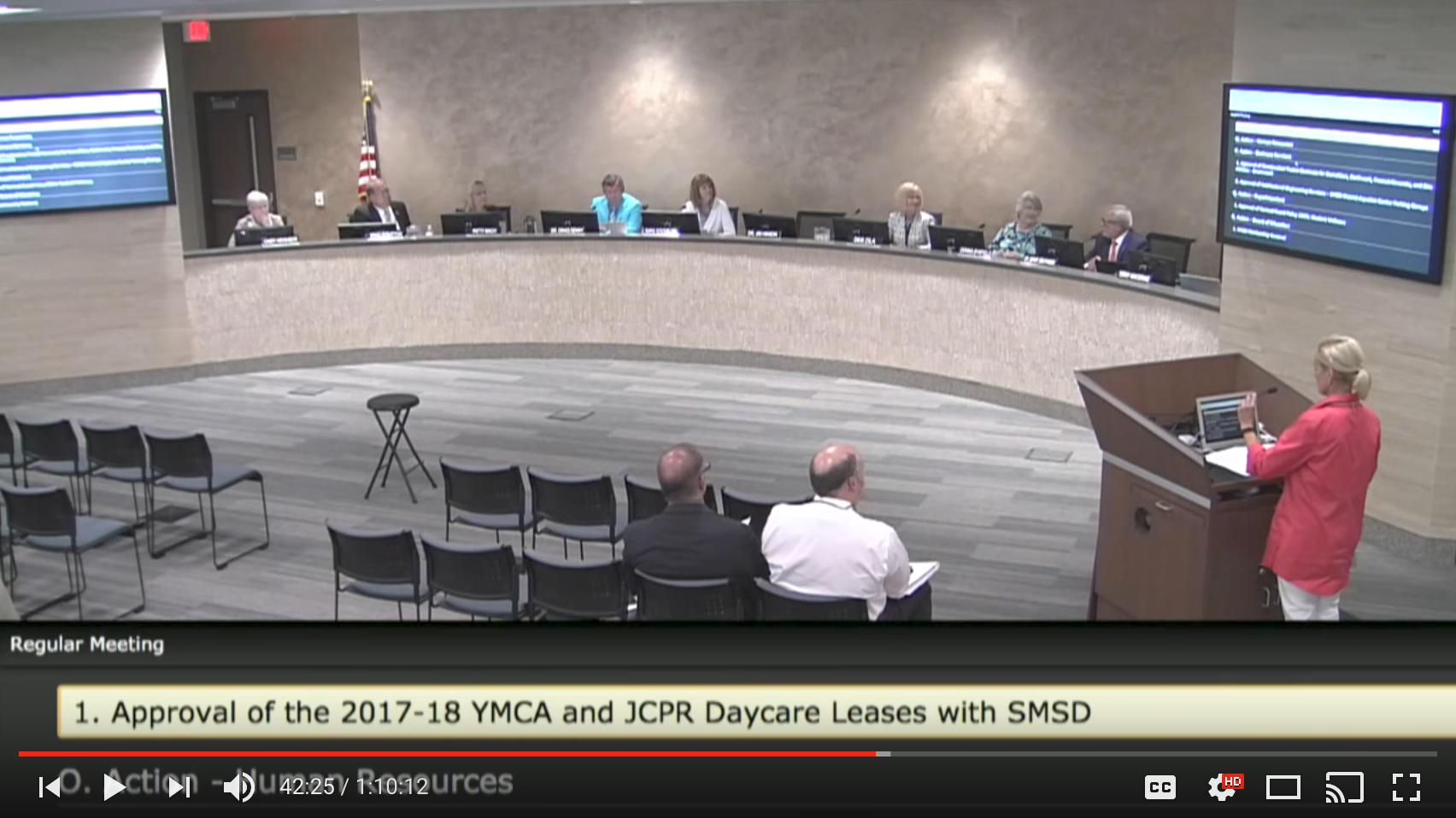
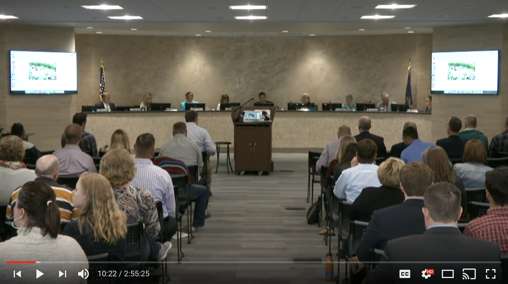 May - Wide Angle Room View
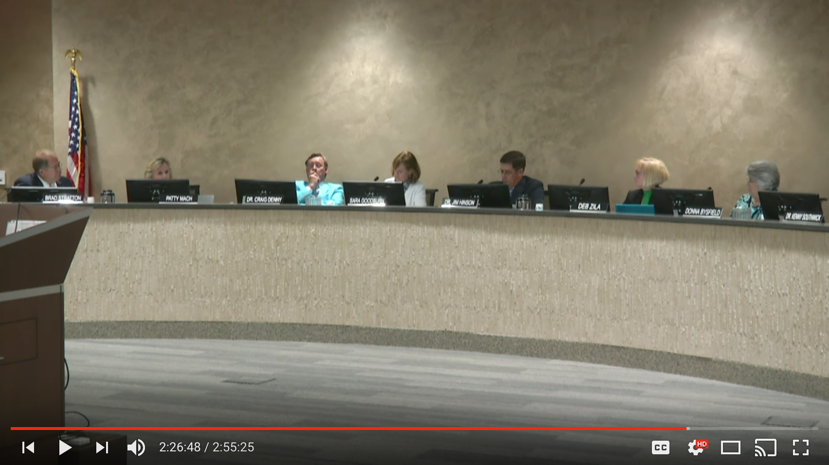 May - Full Board View
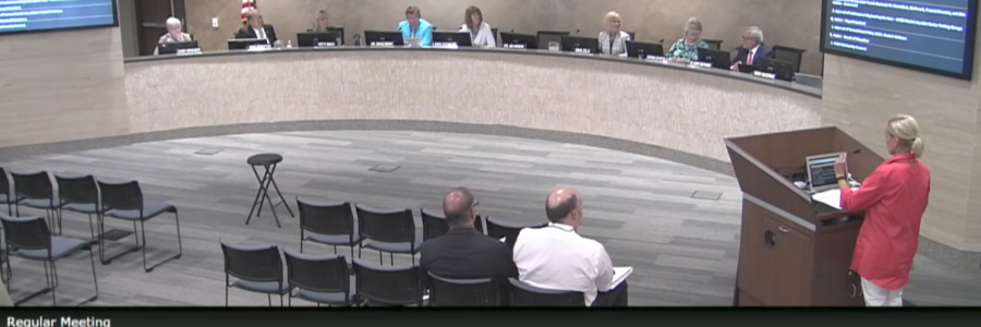
 May - Audience Podium
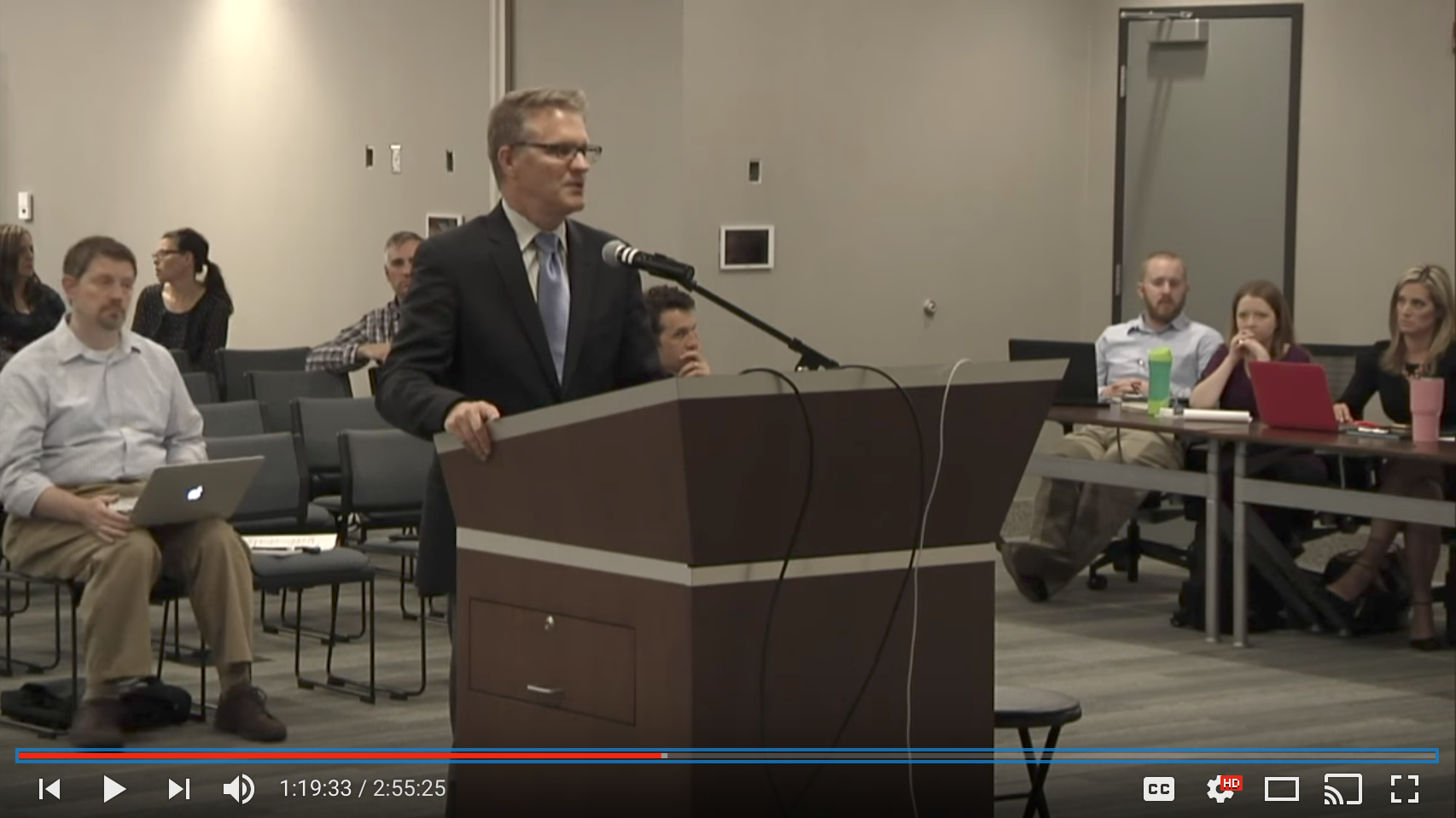
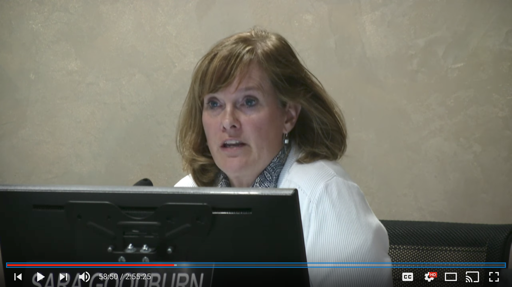 May - Panning Board Member Closeup
These four views allow the watcher to clearly see who is talking and their facial expressions. I'm not sure if there is a camera operator or automated technology doing this, but hats off to those producing these multi-camera meetings.
Now here's what we saw for June's meeting...
That's it. That's the only camera view we see the entire meeting. We see no board member closeups, no wide angle room view, and no podium close up.
It was clear that there still was an operator running the video since the shot would switch to the presentation slide and occasionally I would see the agenda item at the bottom of the screen.
The podium was moved off to the right, so maybe the podium camera hasn't been adjusted. But that doesn't explain why the other camera view weren't used.
So what's the big deal?
- The podium camera is the most important view aside from the full board view. Those speaking, whether community feedback or requested speakers, are an essential part of the meetings and deserve to be heard AND seen. Leaving this view out casts the speakers as unimportant.
- The board member close up is also essential to the viewer so that we know who is talking, where they are looking and their facial expressions. Most of these things are not visible from the full board camera
- The wide angle view is helpful to see the audience. Only seeing part of 4 rows (2 rows with the agenda showing) of chairs doesn't give the viewer an accurate understanding of how well the meeting is attended by the community. The wide angle view of the May meeting shows 9 rows.
There might as well not be a video recording of the meetings if this is the only view we get.
It's my hope that this was either a one-time thing because of the regular camera operators were unavailable or that this was a test that has been viewed as a failure. What ever the reason, June's recording is a severe downgrade to the previous recoded meetings and should not be repeated.